Design
yohakuのロゴ
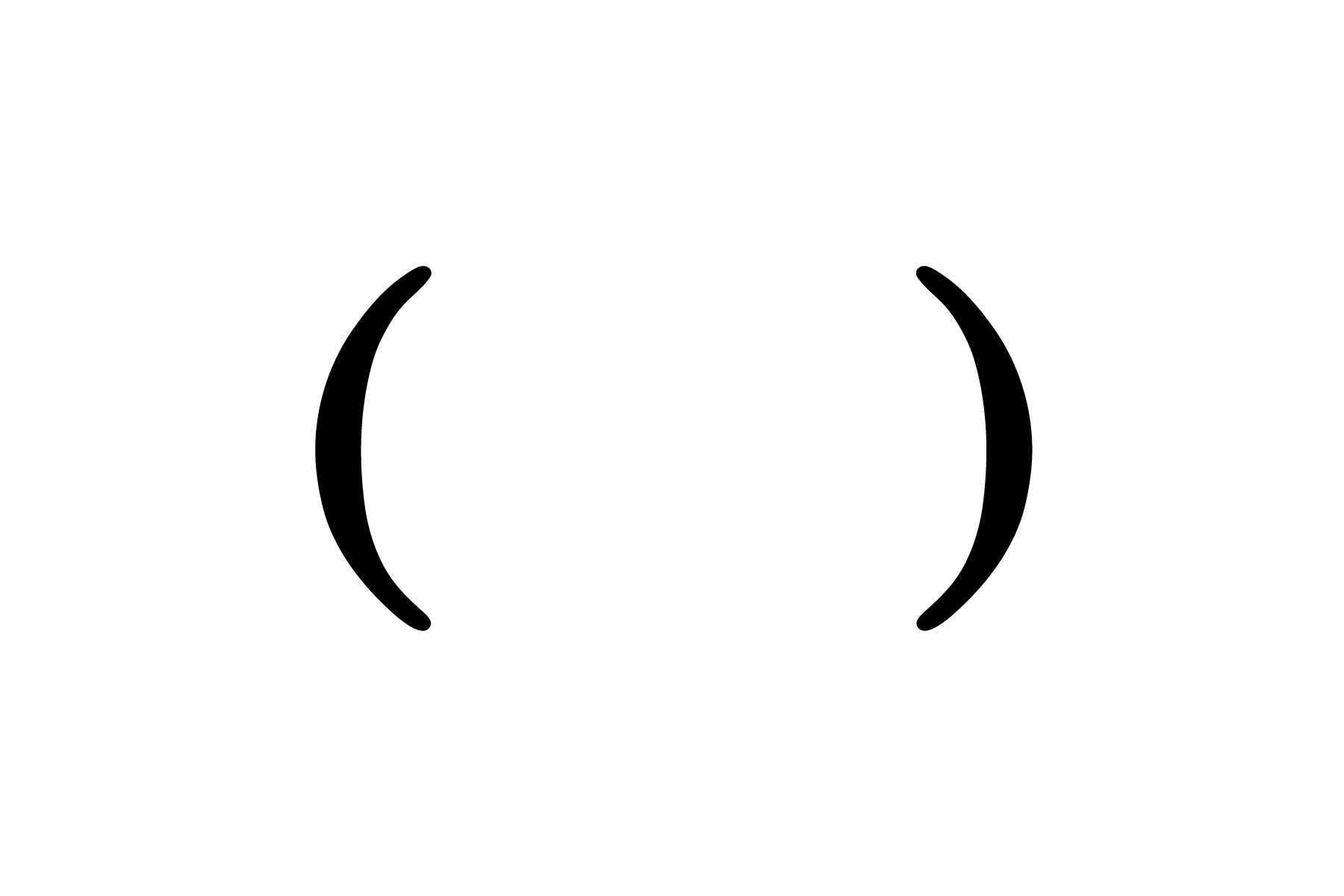
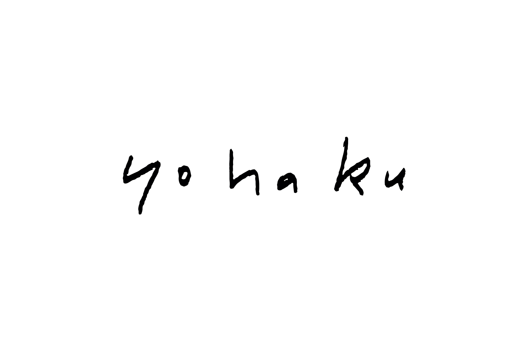
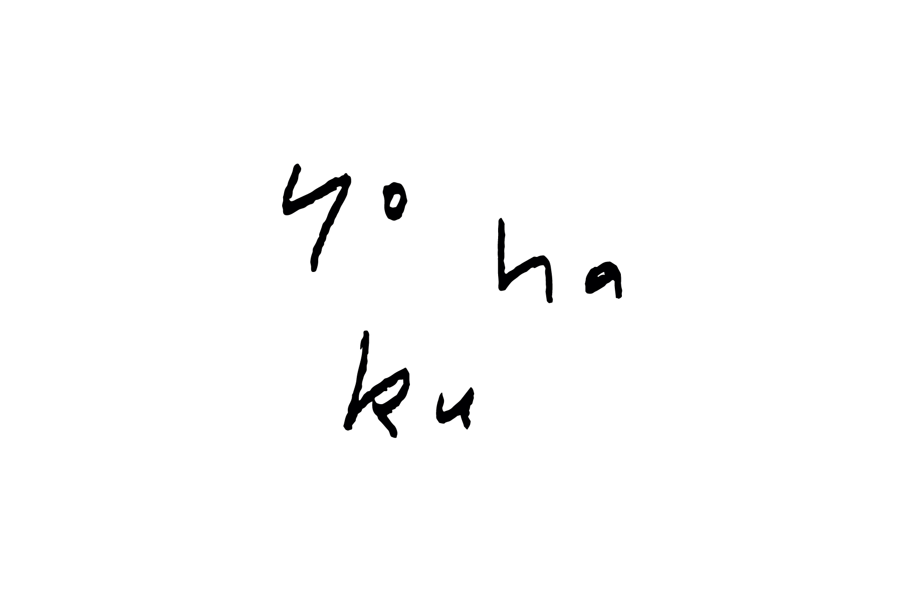
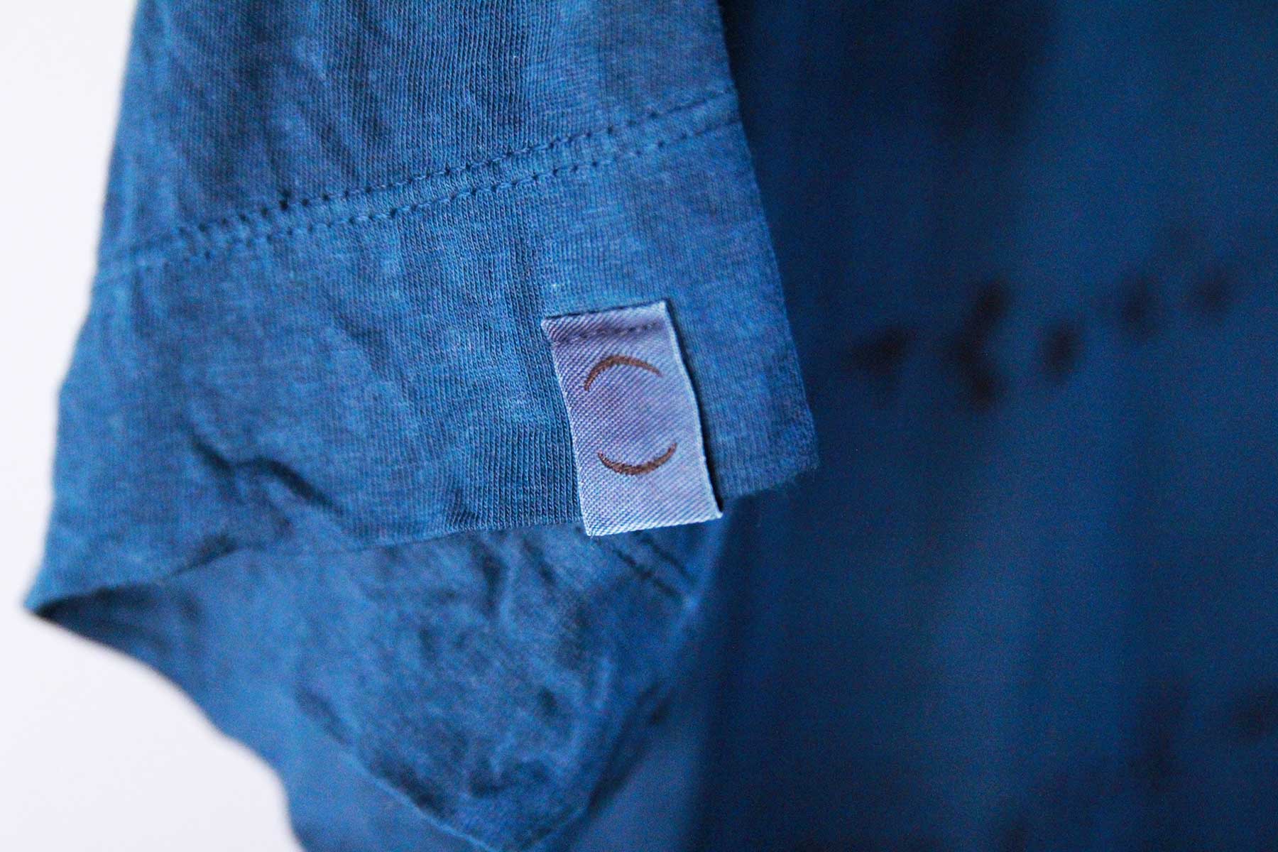
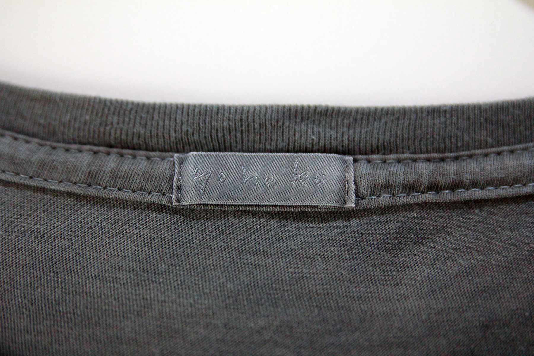
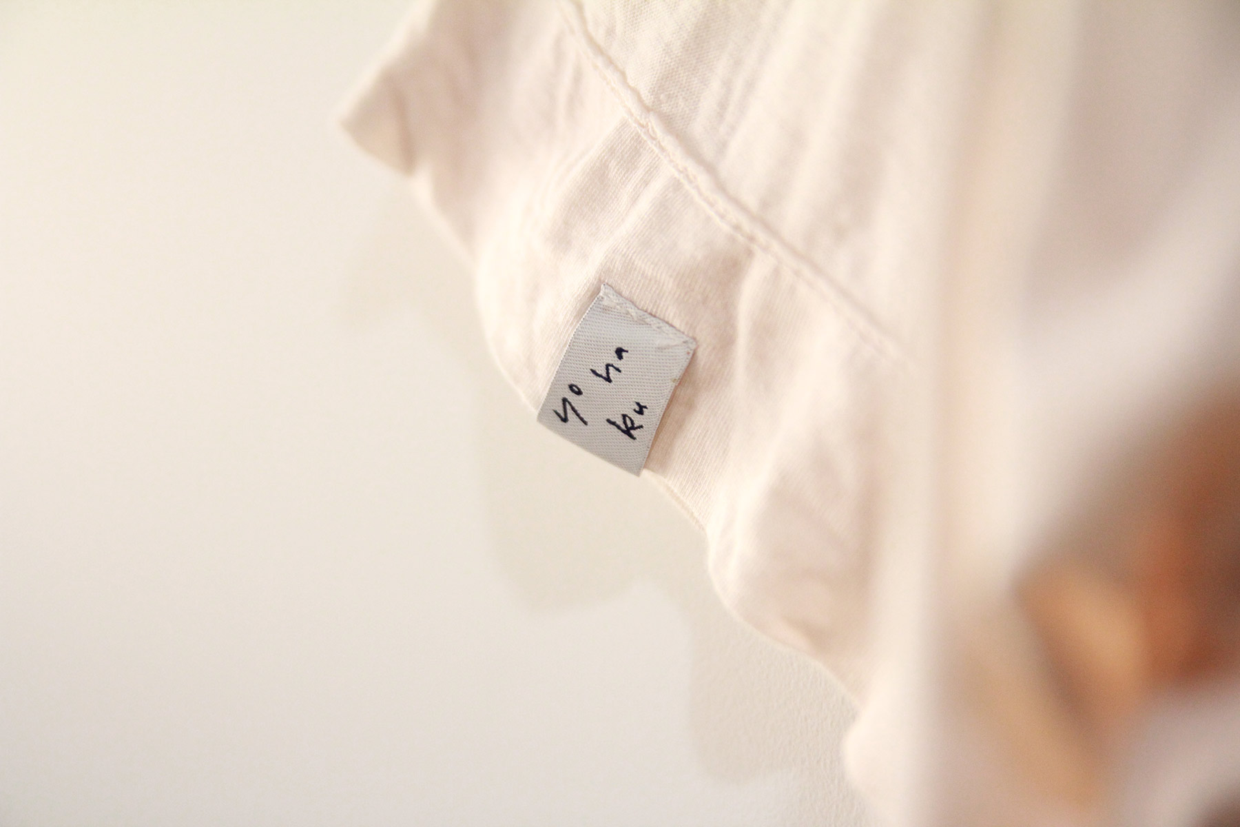
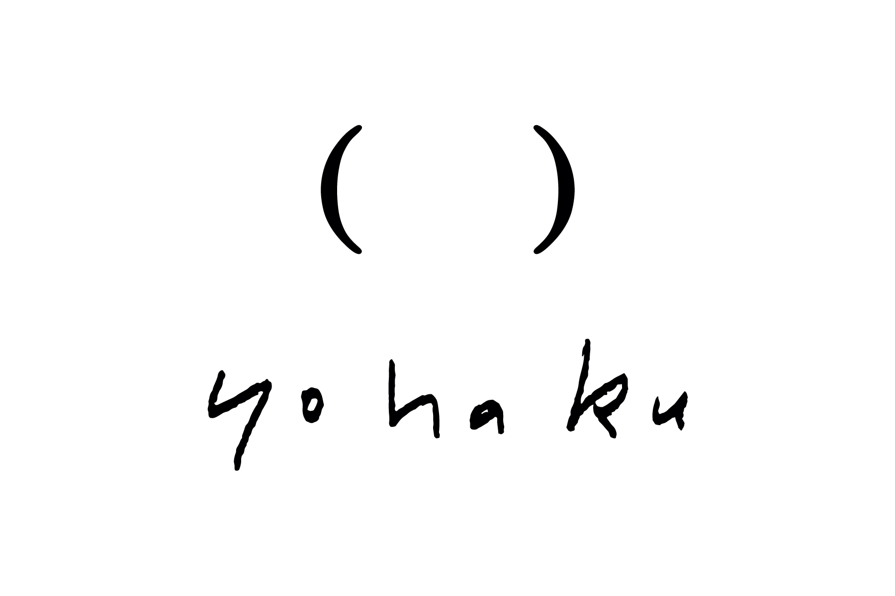
「yohaku」は、1969年に肌着製造会社として創業された株式会社サンカーベが、2009年に立ち上げたファッションブランド。人が物を手にするとき、その人とその物の間には、空間=余白が存在しています。生まれた余白をどうするのか、その意識の仕方次第で、その物の見え方・感じ方はもちろん、人と物との繋がり方も新たなものになります。であれば、物を作るメーカーとして、自分たちは今どんな商品を送り出していくべきなのか——「yohaku」によって生まれる洋服には、その哲学が貫かれています。同じく2009年から、同社してきなしごとのシンボルとして使われてきた、括弧の形のロゴ。2017年秋にこのロゴを見たサンカーベ社長・渡辺氏の熱烈な思いを受けて、また期を同じくして新たなロゴを迎え入れることになっていたしてきなしごとの転換期も重なり、前代未聞の「ロゴ譲渡」が行われました。それに伴い、オリジナルのタイポグラフィを制作。2018年春以降、商品のタグなどにて、順次反映されています。
“yohaku” is a fashion brand launched in 2009 by Sankabe, the company producing underwear which established in 1969. When people meet some object, there is blank space (yohaku in Japanese) between them. And the blank space makes new relationship of people and object depending on how we think the space—for example, filling space or leaving much space. yohaku keeps thinking what kind of products they should send all over the world and all kind of clothes of yohaku is maintained this philosophy. To tell the truth, this new logo mark has been used as the logo mark of SHITEKI NA SHIGOTO since 2009—as it happens, yohaku was our contemporary! When Nobuyuki Watanabe the president of Sankabe met Go Uchida in autumn in 2017, he was surprised from the bottom of his heart because the shape of ex-logo of SHITEKI NA SHIGOTO meant blank. At the same instant SHITEKI NA SHIGOTO had a plan to change our logo mark in 2018. As a result, the transfer of logo mark amongst yohaku and SHITEKI NA SHIGOTO materialized. We designed the original typography for yohaku due to the transfer. yohaku is changing its logo mark to its all products accordingly after spring of 2018.
Direction, Design: Go Uchida