Design
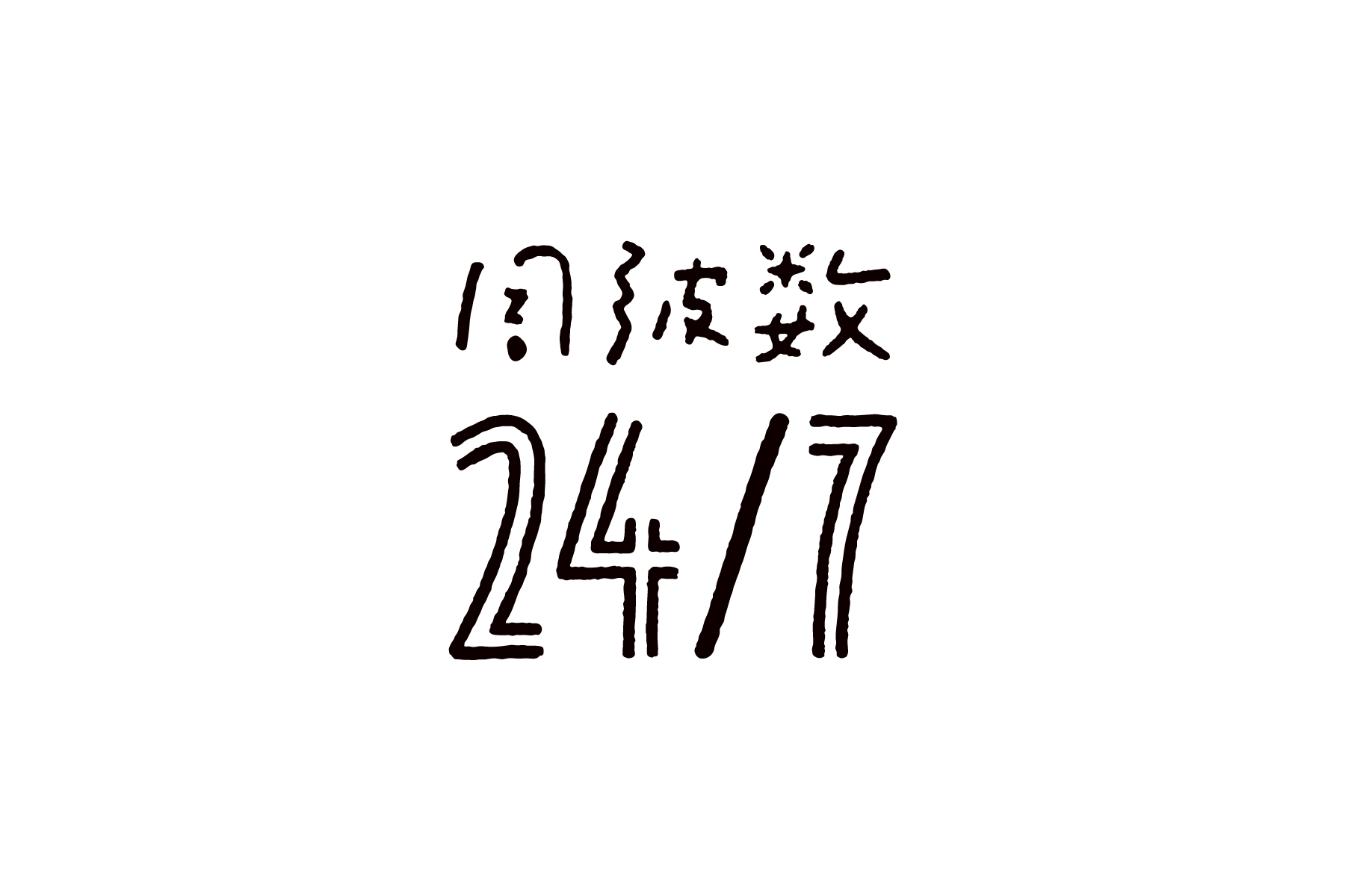
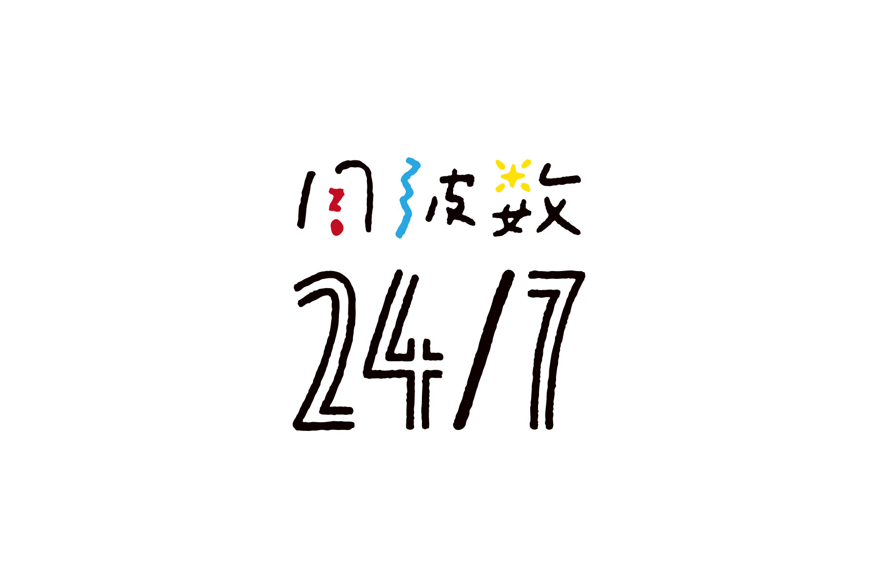
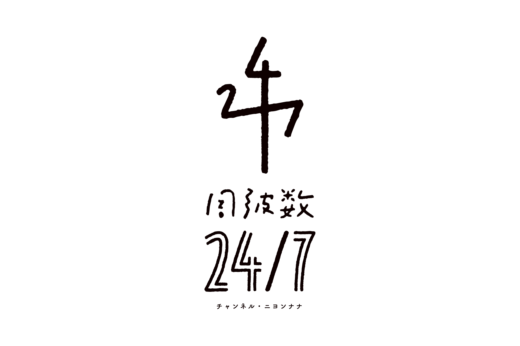
周波数24/7のロゴ
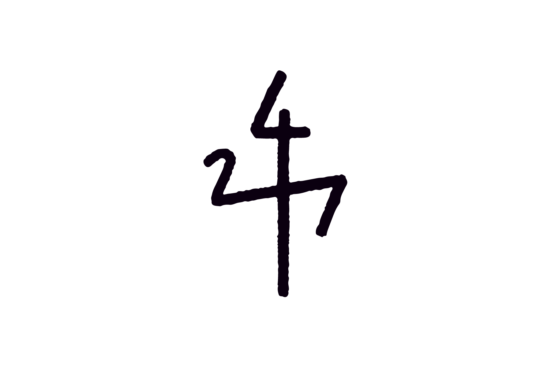
「周波数24/7(チャンネル・ニヨンナナ)」は、テレビ局で映像ディレクターを務める仁科賢人氏の、プライベートプロジェクト。自らの姓を捩った「24/7」は、「1日24時間・週7日」の意。信州・松本で彼の愛する被写体を、映像を通して、日々伝えてゆきたいという思いが込められています。メインビジュアルは、アンテナの形。「周波数」のオリジナルタイポグラフィには、撮影や映像制作のスタンスや初心を忘れないよう、興味・伝心・希望のモチーフも、こっそり盛り込んでいます。
Channel 24/7 is a private project of Kento Nishina who works at one broadcasting company as a director. 24/7 is a pun on his family name and means “24 hours a day 7 days a week.” This name implies his thought that he want to tell everyone and everything in Matsumoto he loves through the film. The main graphic is modeled the shape of an antenna with all numbers 2, 4 and 7. And the original typography implies INTEREST and COMMUNICATION and HOPE motifs to keep his mind as open as when he began.
Client: Kento Nishina
Direction, Design: Go Uchida
Direction, Design: Go Uchida