Design
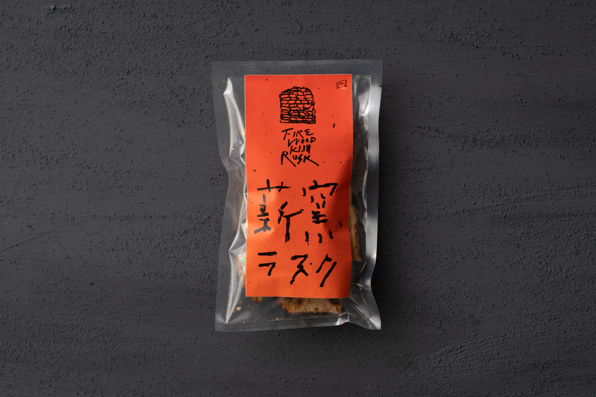
わざわざ薪窯ラスクの題字・パッケージ
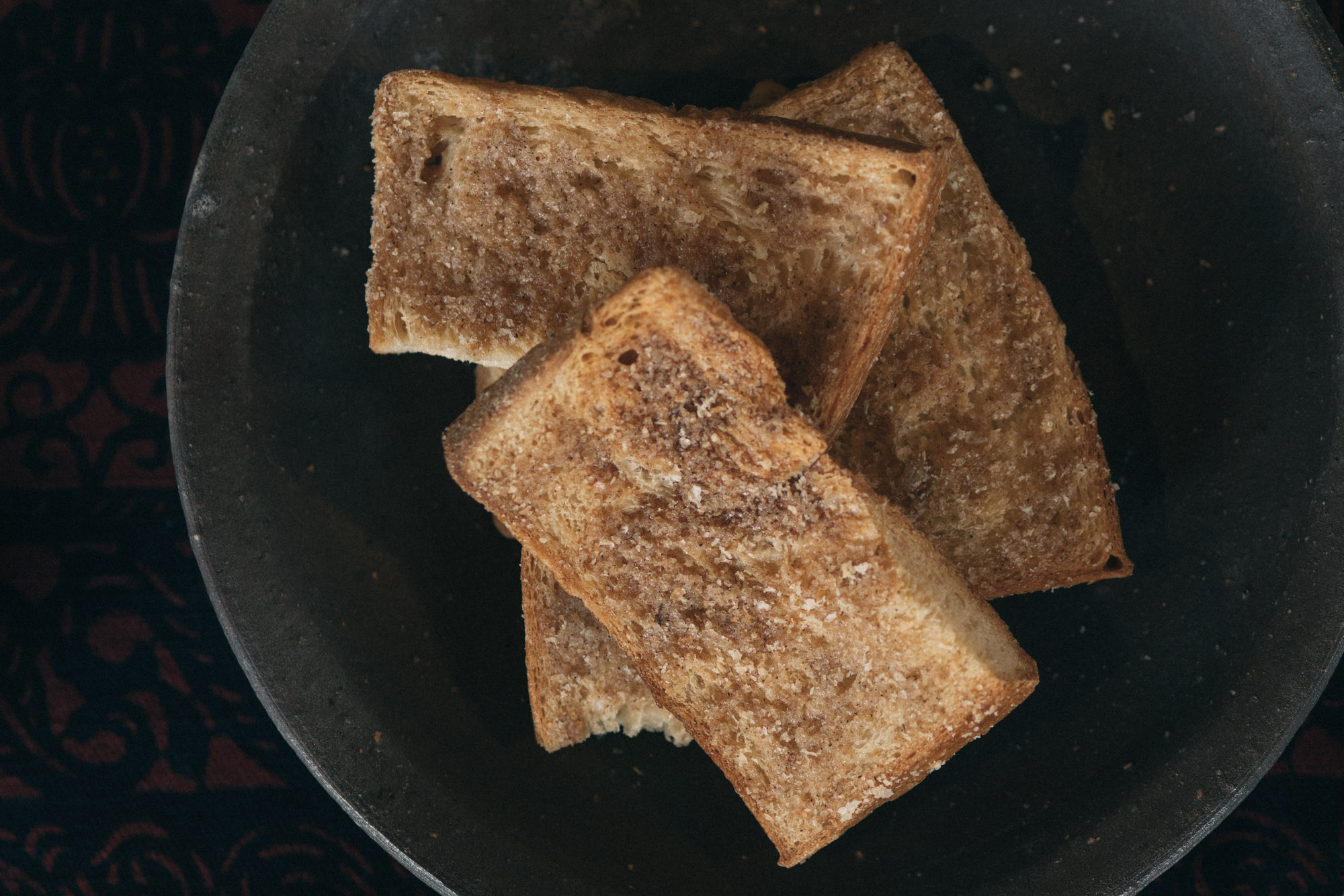
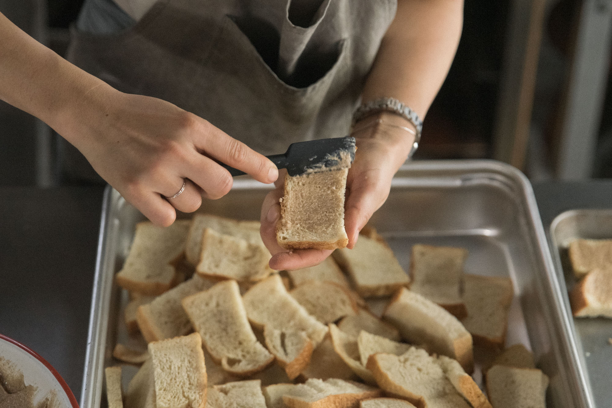
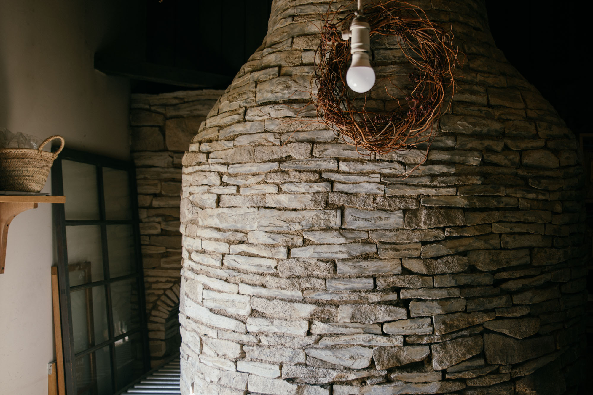
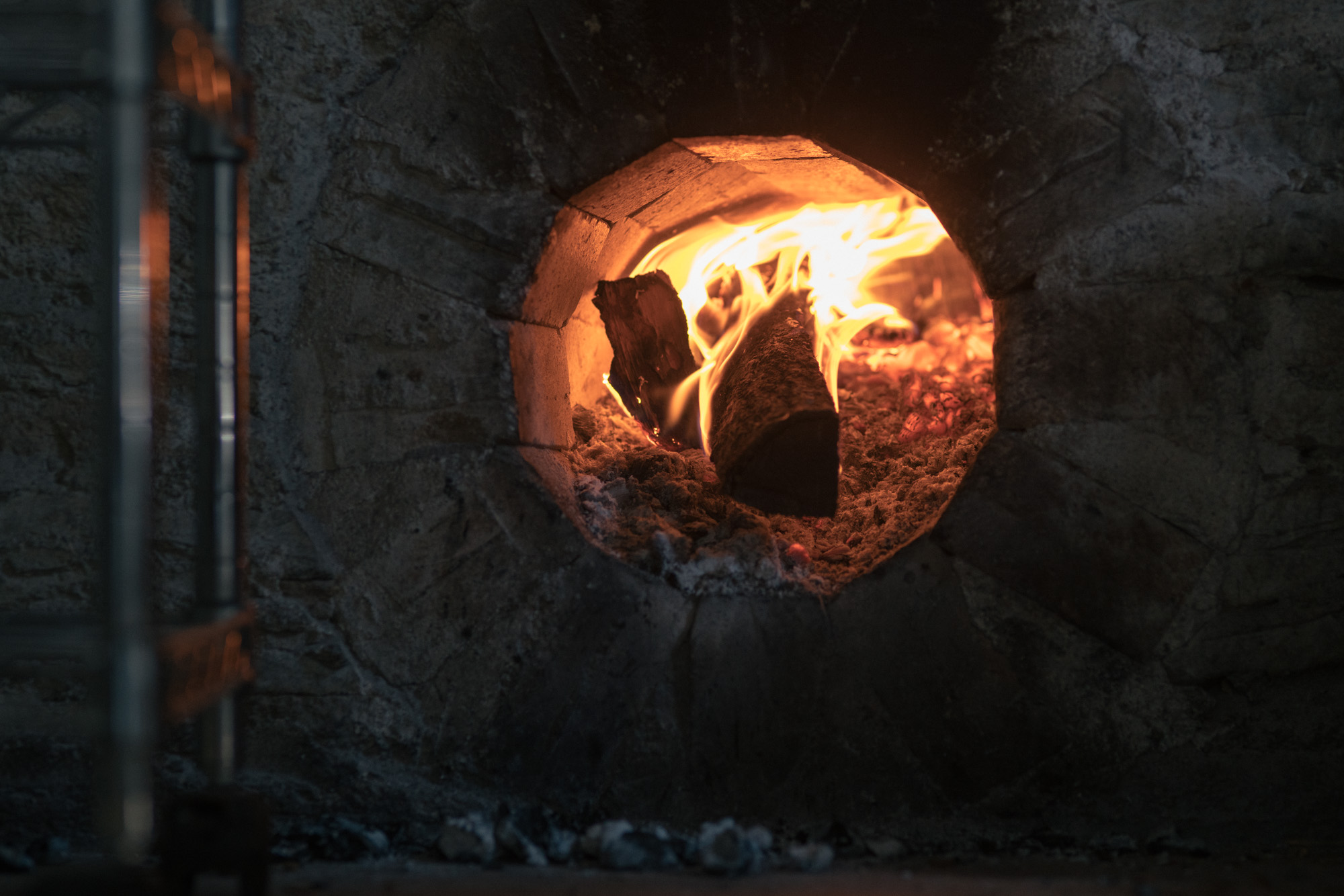
長野県東御市のパンと日用品の店「わざわざ」は、毎日同じ量のパンを仕込み販売することを、一つのスタンスにしている。売れ行きに左右されないパン作りは、作業性とスタッフの就業環境の向上を意味する。そのように生まれたパンは、品質・味が共に安定し、結果、顧客へ最も美味しいパンを提供できるのだ。しかし、そのスタンスは、パンが余る可能性も孕んでいる。わざわざは、この余ったパンを美味しいお菓子にしてきちんと売ることで、食糧の大量廃棄という問題にも対応しようと試みている。働き手の充実、買い手への温かな思い、社会問題への意識、より良い売り手であろうとする強い情熱。美味しく、そして心も満足できるお菓子の裏側にある意識を、薪窯のうちに宿り続ける熱とシンクロナイズさせながら、ラベルをデザイン。ラベルカラーは、パンを焼く薪窯の熱とわざわざの情熱の色、商品タイトルの文字は、爆ぜる薪や香ばしいラスクの質感をイメージして、制作している。
Snack Package Designing, Firewood Rusk for “wazawaza"
“wazawaza” is a shop serving bread and daily necessities in Tomi-city, Nagano prefecture. They make it a rule to prepare and sell the same amount of bread every day. By doing so, their bread making are not going to be influenced by sales. This method leads to the improvement of both efficiency in operations and working environment so that they can serve bread stably in quality and taste. For customers, as a result, it is possible to enjoy bread in the best condition. Still, there remains the probability to create a surplus, namely, mass food disposal. To deal with the problem, they try to sell snacks made with surplus bread. Enrichment of working environment, imaginations towards customers, active attitudes to social problems, passions to be better than ever, these are what they take into consideration all the time. When designing the package design, I intended to express the idea “snacks will make us pleased in taste and our heart” by drawing firewood oven. Additionally, the color used in its label demonstrates heated oven and passionate posture. Handwriting title is inspired by the images of oven burning inside and how rusk looks like or tastes like.
Direction & Design: Go Uchida
Typography: Go Uchida
Photograph: Haruka Hirata, Hiroyuki Wakana (wazawaza)