Design
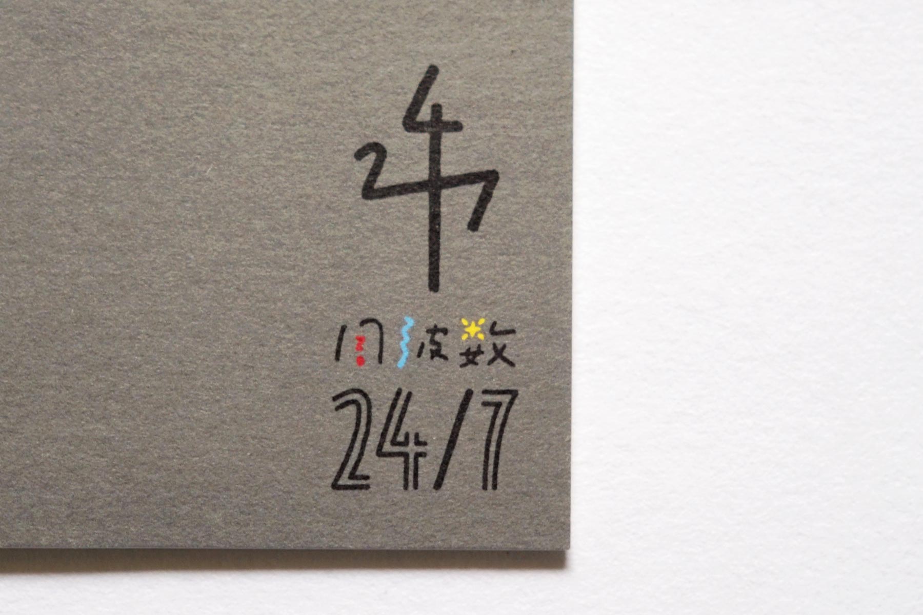
周波数24/7の名刺
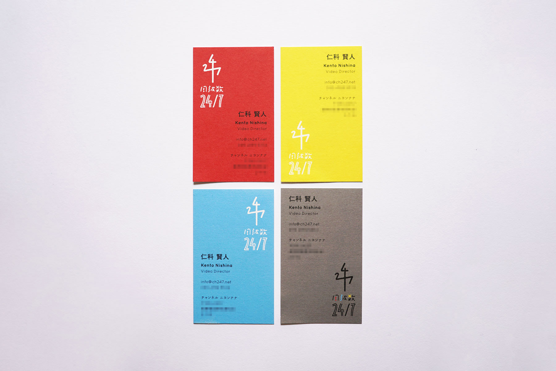
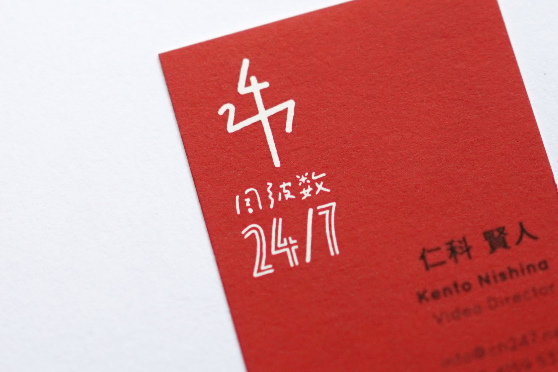
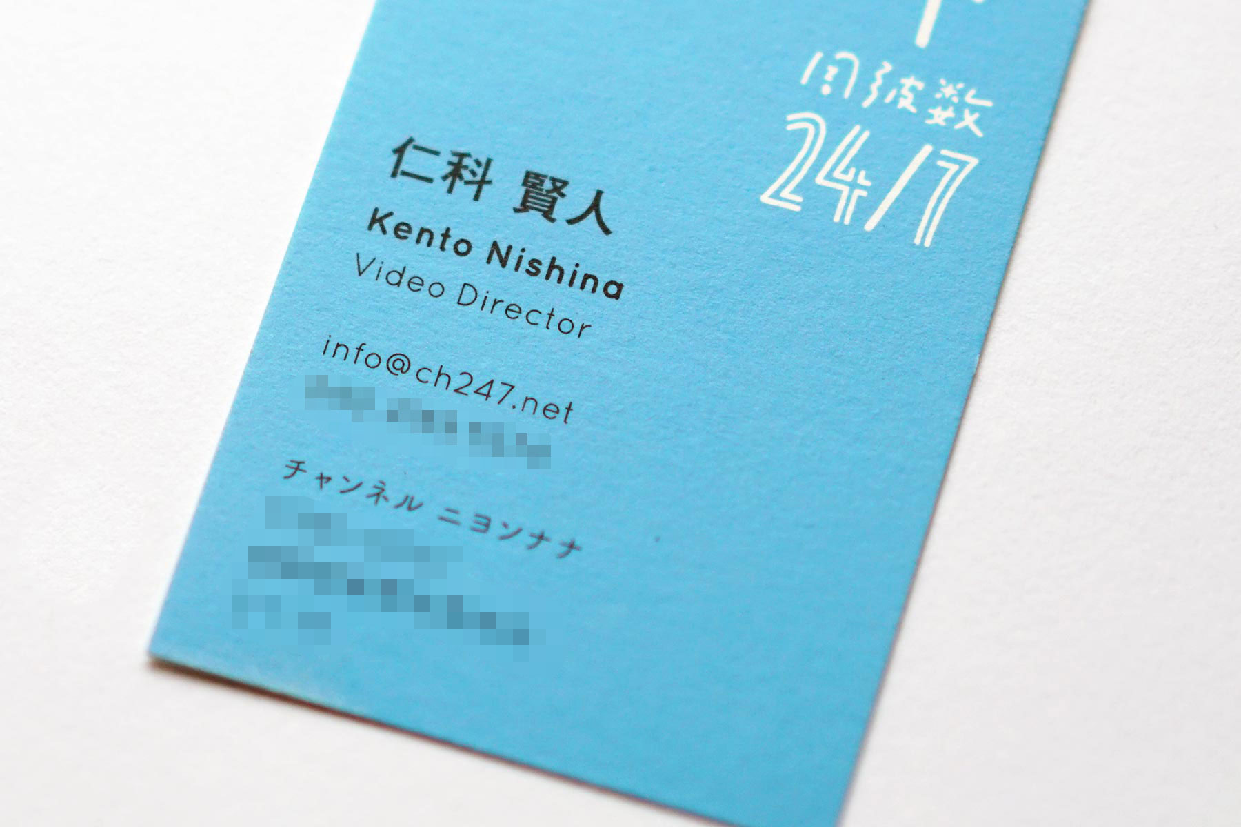
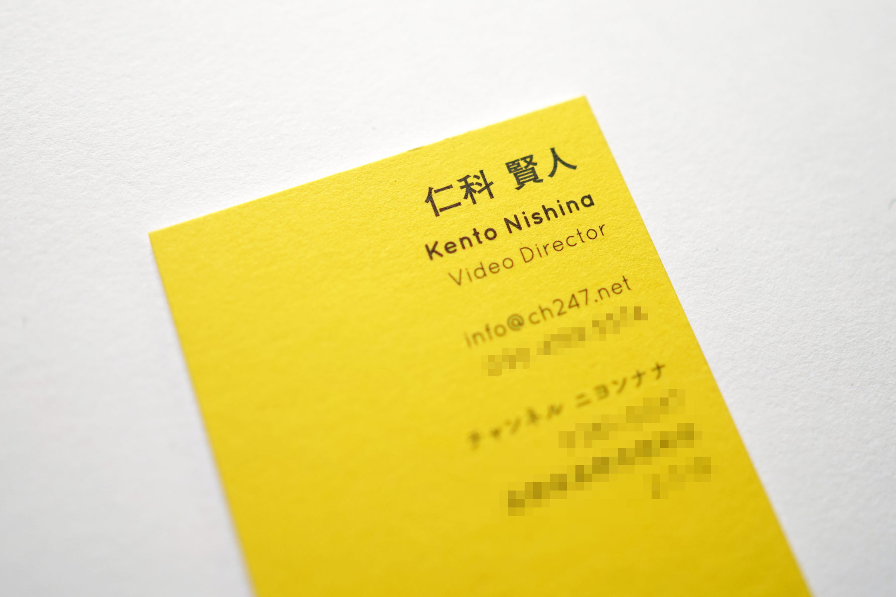
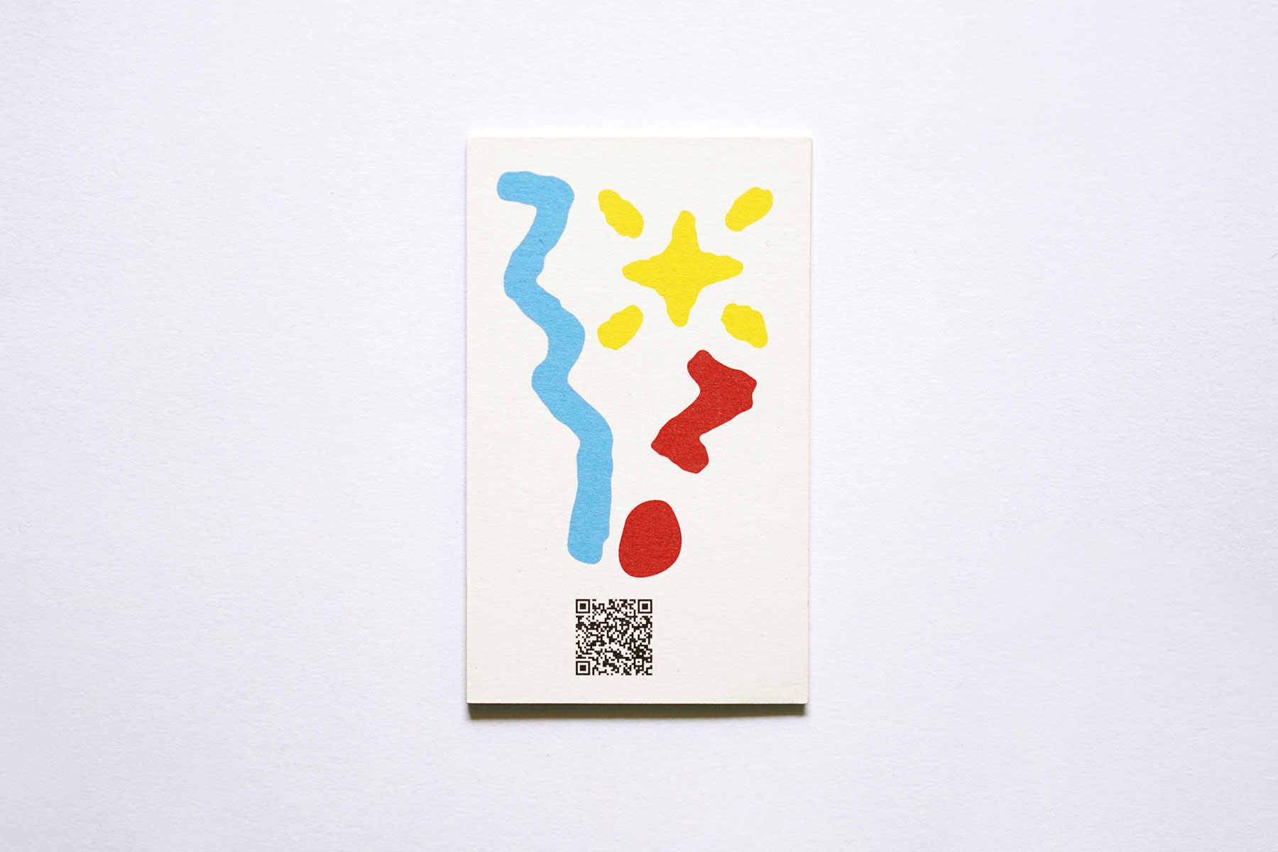
テレビ局で映像ディレクターを務める仁科賢人氏の、プライベートプロジェクト「周波数24/7(チャンネル・ニヨンナナ)」の名刺を、デザイン。自らの姓を捩った「24/7=1日24時間・週7日」には、信州で彼の愛する被写体を、映像を通して、日々伝えてゆきたいという思いが込められており、ロゴデザインの際には「周波数」のロゴタイプのなかにも、その意匠(「赤い疑問符=自分の興味に向き合う」「青い波線=心を込めて伝える」「黄色い星=自分も世界も輝く」)を盛り込んだ。外に発信する意欲を積極的にPRすべく、名刺のオモテ面には、撮影・制作した映像を鑑賞できる動画共有サイトのQRコードを配置、ロゴタイプに込めた3要素の意匠が、QRコードから溢れ出すデザインに。ウラ面のデザインでは、ロゴに採用したカラー4色を用いて、手渡された人が思わず楽しくなるよう、4パターンのレイアウトを制作した。用紙には、特殊東海製紙の「波光」を採用。「光を当てる、光で制作される映像を、電波に乗せて伝えていく」という仕事の特徴と、紙名が符合していることから、採用を思いついた。柔らかな温もりと自然の風合いを感じる紙質は、「映像制作の堅さから離れた、柔らかい仕事、温かな映像を作ってゆきたい」という思いにも通じている。
Business Card Designing for "channel 24/7"
I designed a business card for the private project named “channel 24/7” run by Kento Nishina, a video director in TV station. The name “channel 24/7(channel ni yon nana)”, pronounced similarly as his surname, means “24hours a day, 7days a week”. It is his message that in a daily life, he wants to deliver beautiful things in Shinshuu to people by making video clips. Related to this story, the logo includes three designs. Each design refers to each different function; a red question mark implies living in touch with curiosity, a blue wavy line represents delivering videos with all his heart, and a yellow star depicts us and the world sparkling brightly. The QR code placed in the front is made to promote channel 24/7’s positive activities to the world in that the code enables us to enjoy channel 24/7 works in video hosting website. Also, the three iconic design above the QR code are arranged to look overflowing. Contrarily in the back side, in order to make people come to feel like enjoying the card, there are four design patterns using four colors extracted from the logo. Regarding to paper, I selected “Hakou” from Tokushu Toukai Paper because his attitude towards works is correspond to its name “Hakou” (“wave light” in English) in the way that his motto is “highlighting things, creating videos with those topics, and passing them on to people with radio waves. ” The texture of paper is warm and natural enough to reminds us of his perspective, which is that despite existing stiff impression, video productions are supposed to be soft and light, and heartwarming.
Direction, Design: Go Uchida