Design
iroiroのロゴとカード
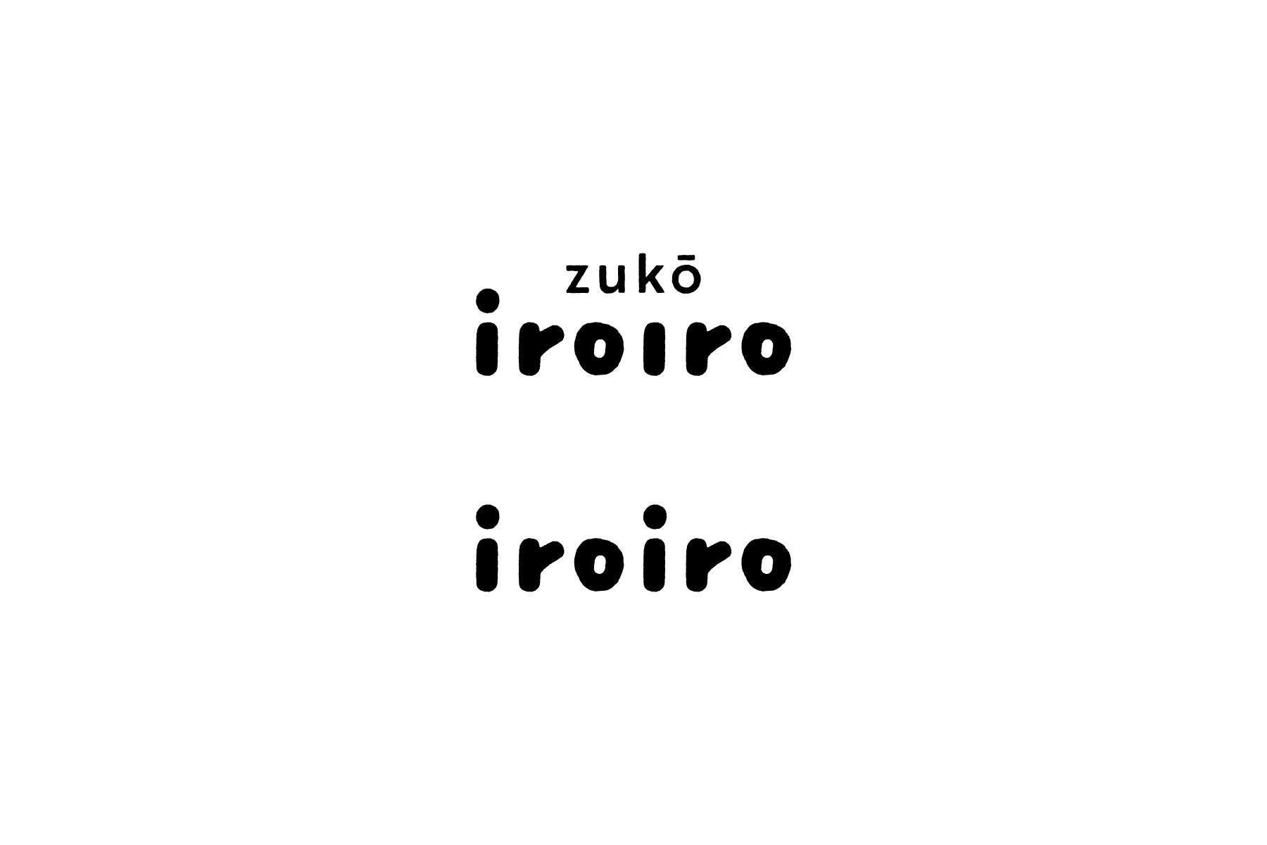
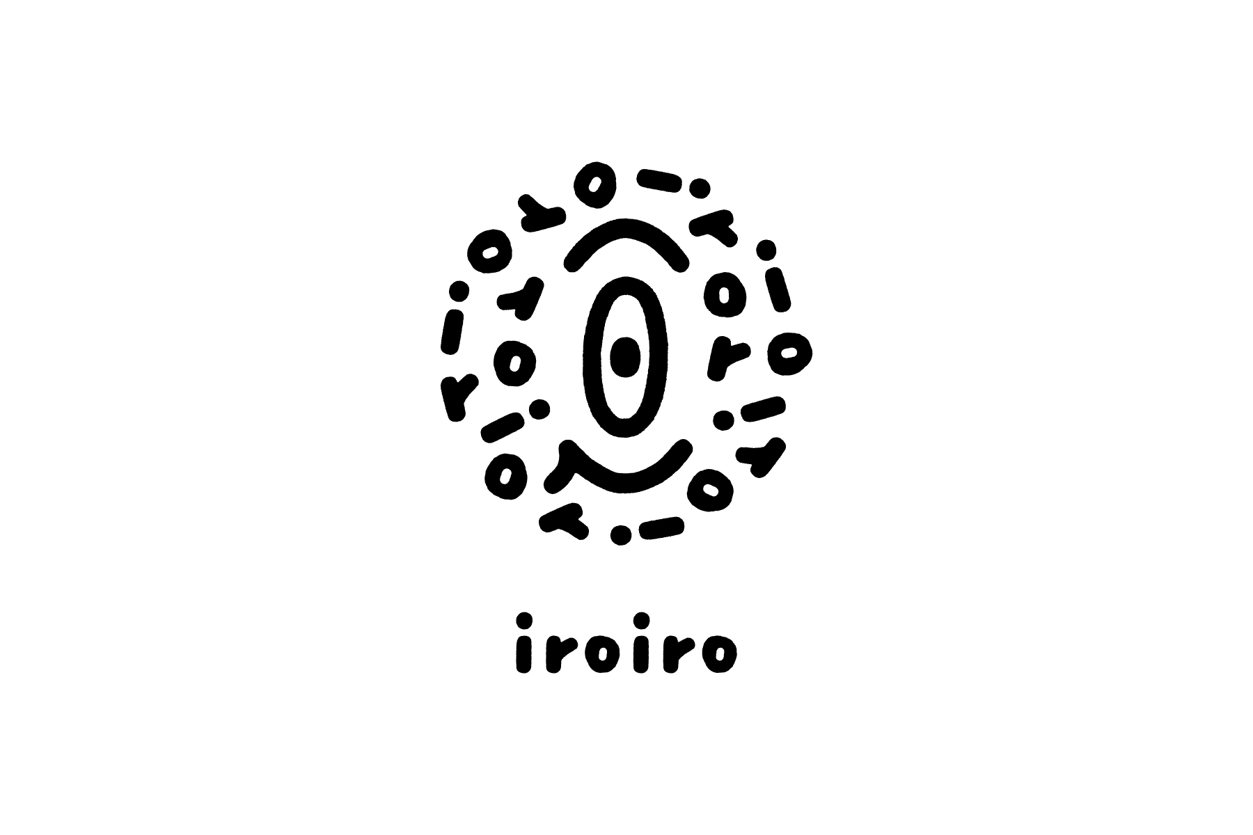
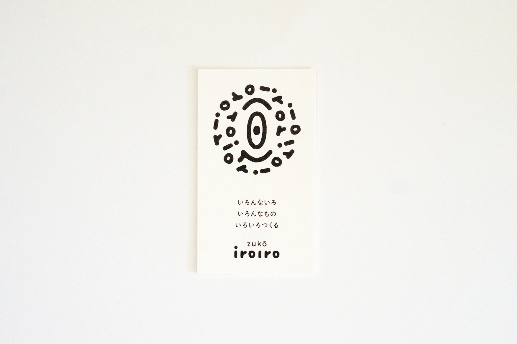
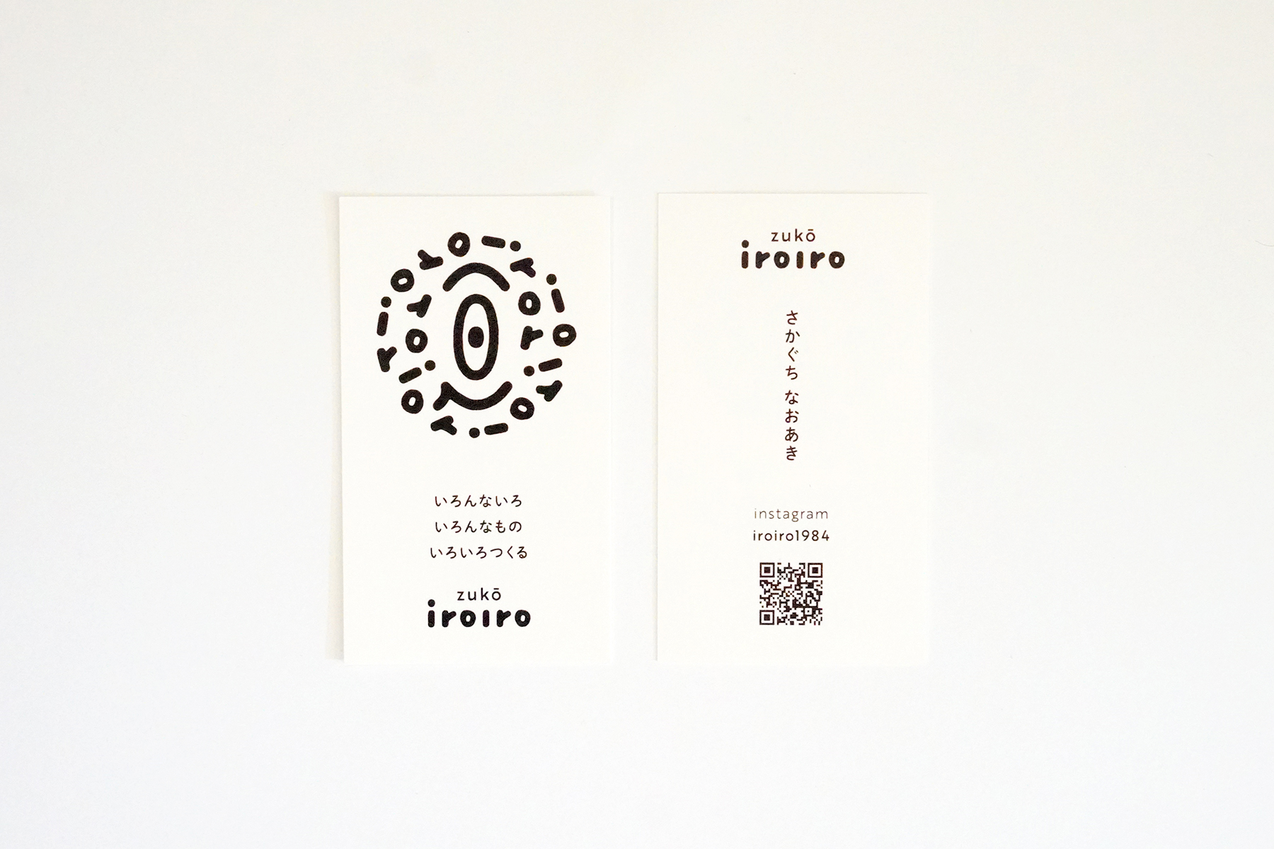
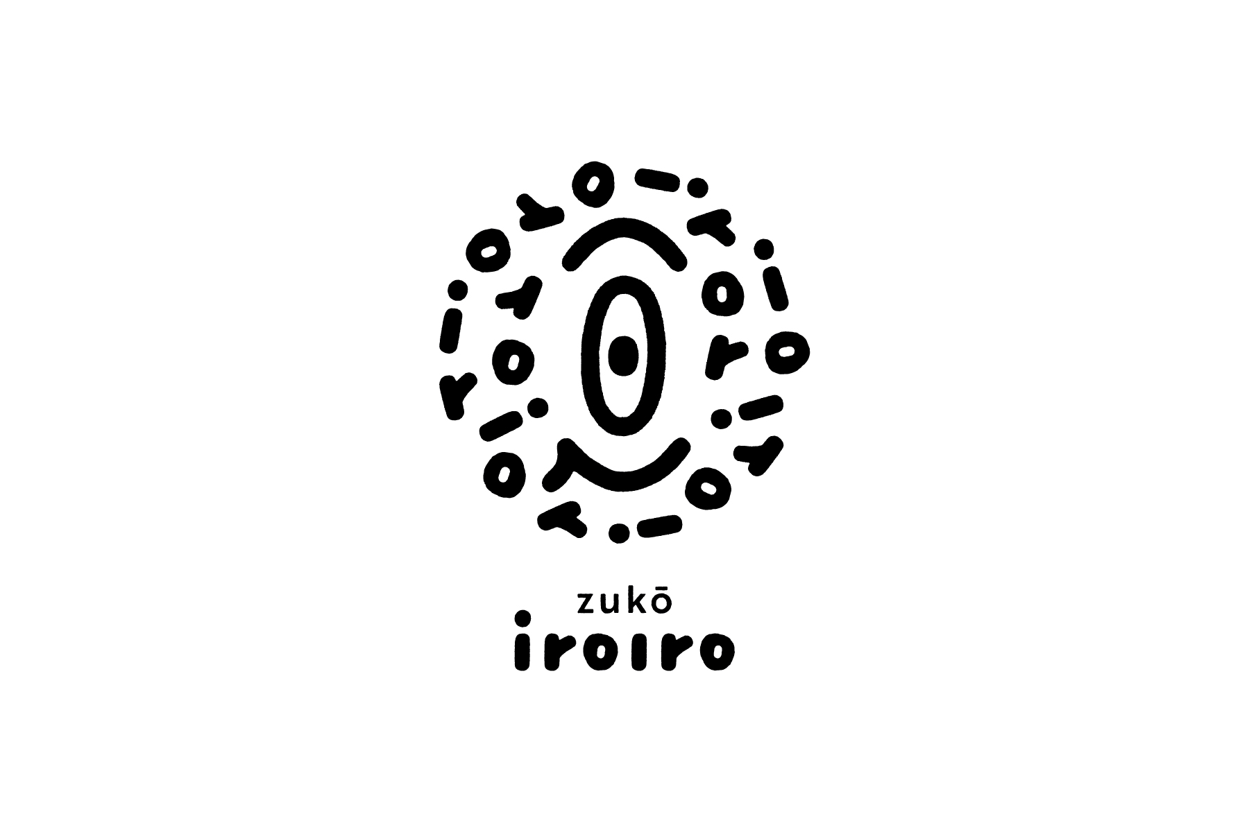
“いろんないろ、いろんなもの、いろいろつくる”を合言葉に、長野県内でステンシルアートや木の実のオブジェなどのものづくりやワークショップを行っている坂口直謙氏のプロジェクト「iroiro」。これまで以上に自由にそして盛んに活動を続けていくための基点としてのロゴマークを制作。“いろいろ”を体現するために必要不可欠なものとして、物を見抜く力のある一眼識や独得の見識・批評眼を意味する〈一隻眼〉をモチーフにしたロゴ。他にもギリシア神話の〈単眼の巨人キュクロープス〉(手先の器用な鍛治職人の神)、古代エジプト・天空神ホルスの左目〈ウジャトの目〉(癒し・修復・再生の象徴)など、さまざまなシンボルから象った。ワークショップでは子どもが多く参加することから、ロゴ全体の雰囲気から〈ワクワク感〉を感じられるようにデザインしている。
Iroiro is a project by Naoaki Sakaguchi who creates stencil art, nut objects and other crafts and holds workshops in Nagano Prefecture with the motto of creating all kinds of colours, shapes and things. I designed the logo mark as a base for continuing his activities more freely and actively than ever before. The logo was designed on the motif of a single eye which means a single eye with the ability to see things through, unique and keen insight into the nature of things. There are also various other symbols such as the monocular giant Cyclops from Greek mythology (the god of skilled blacksmiths) and the Eye of Udjat that is the left eye of the ancient Egyptian sky god Horus (symbol of healing, restoration, and regeneration). In his workshop, many children used to participate in it, so I designed the logo has a sense of excitement.
Direction, Design: Go Uchida