Design
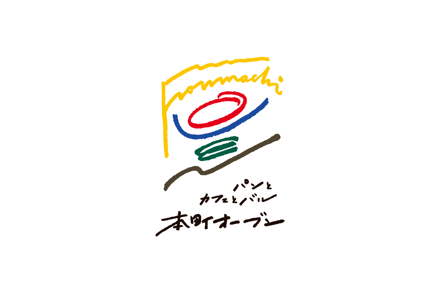
本町オーブンのロゴ
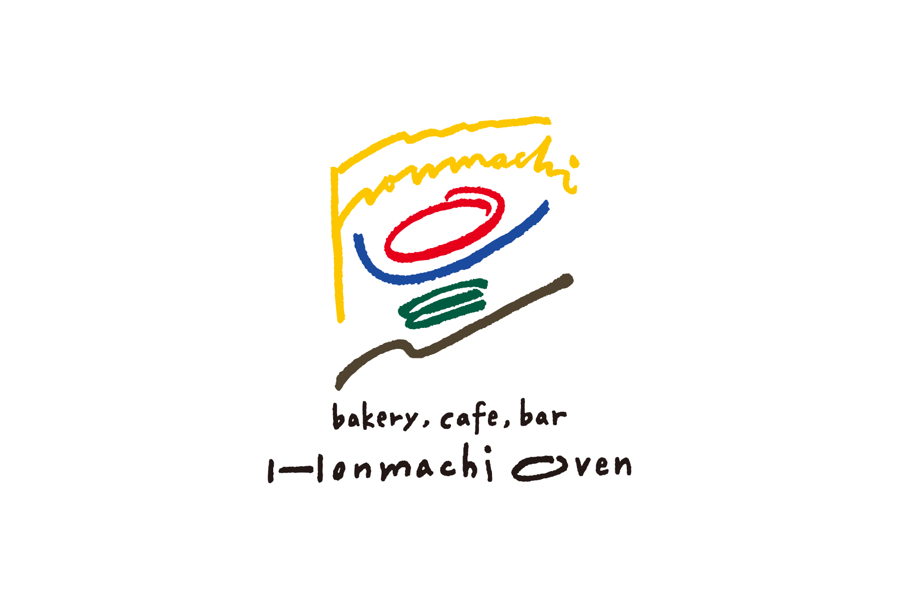
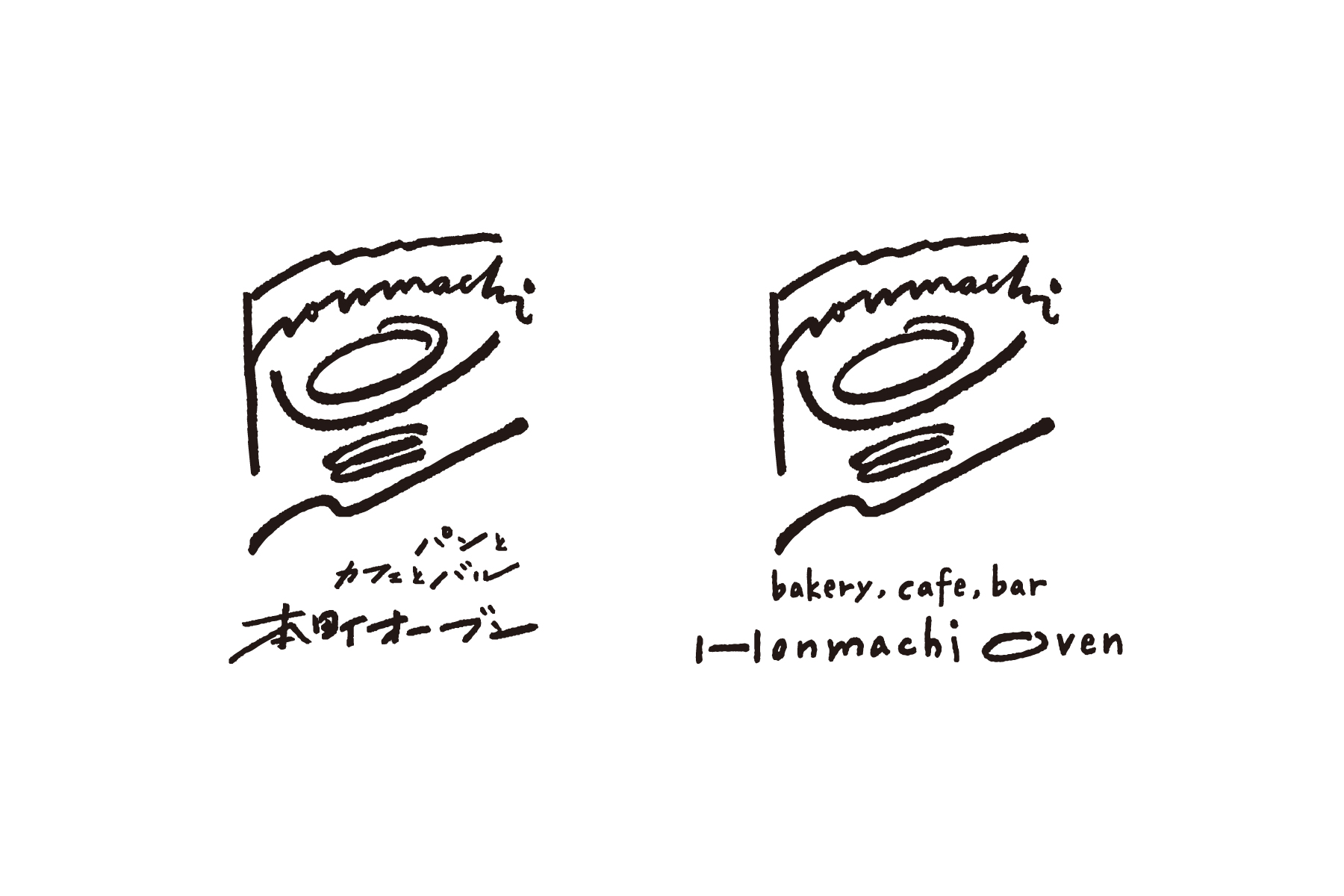
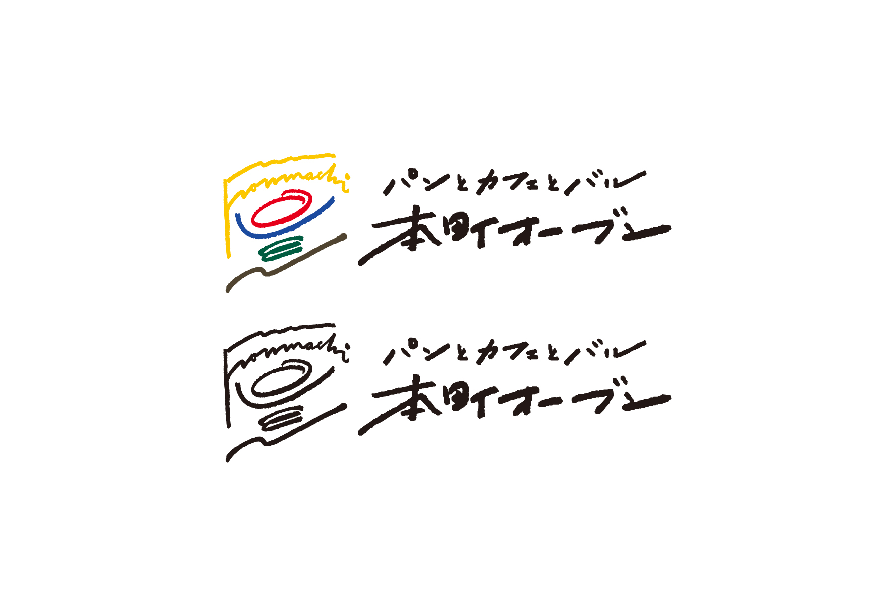
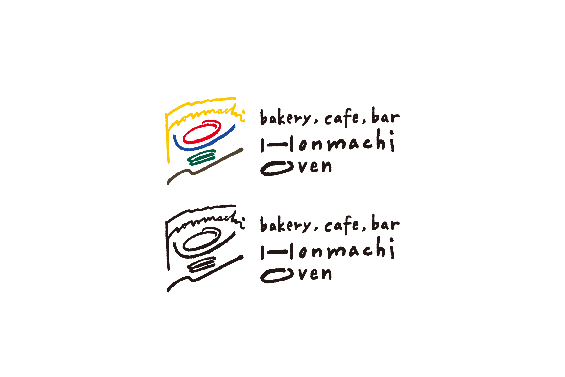
愛知県西尾市に5月オープン予定のパンとカフェとバルのお店「本町オーブン」のロゴマーク・ロゴタイプをデザイン。「空洞化の進む街中にパン屋を開くことで、賑わいを取り戻したい」という思いをモチーフに、“パンが焼けた合図”や“街の新しい旗振り役”を表す〈旗をもつ人〉をロゴに。旗は「honmachi」、人は「OVEN」の文字でできている。「パン屋だからロゴもパンの形に」と考えることをやめたような安易な意匠化に甘えるのではなく、「なぜこの店を始めるのか」という思いや動機、そしてヴィジョンからあるべき意匠を掘り起こした。カラフルな色にもそれぞれ「黄=未来・希望」「赤=太陽」「青=空気」「緑=生命・食材」「茶=大地」と意味があり、人が生きていく上で、パン屋が町でパンを焼き続ける上で、必要な要素を象徴している。
I designed the logo mark and logotype for Honmachi Oven, a bread, cafe and bar shop scheduled to open in Nishio City, Aichi Prefecture in May. Based on the idea of “opening a bakery in an increasingly hollowed-out town to bring it back to life,” I designed a person holding a flag to represent “signal the bread has freshly baked” and “the new flagman for town.” to the logo. The flag is made of the letters “honmachi” and the person is made of the “OVEN”. We don’t hope to settle for the perfunctory design that stopped thinking, like “Since it's a bakery, the logo should be in the shape of bread,” so I dug up the ideal design from the thoughts, motivations, and vision whilst asking a question “Why did they start this store?” These colorful colors also have meanings—yellow is future and hope, red is sun, blue is air, green is life and food, brown is ground.
Direction, Design: Go Uchida