Design
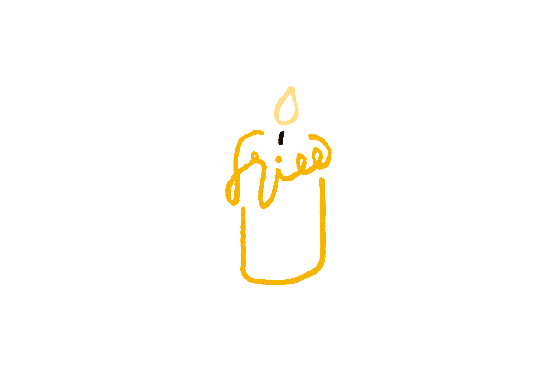
キャンドルブランド「frill」のロゴ
長野県松本市のショップ兼アトリエにて制作・販売・体験レッスンを行うキャンドルブランド「frill」。2024年の年明け、前身の名義から現キャンドルブランドへの名称変更を機に、ロゴマークおよびロゴタイプをデザイン。長野県産の蜜蝋や国産糸を手作業で編んだ芯でできたキャンドルの優しさや温かみを、手描きのロゴマーク・ロゴタイプで表現した。ブランド名の由来は、代表・園原かおり氏の「いつもの暮らしの中に、がんばりすぎず気取らずに、ちょっと丁寧でそして豊かな時間を」という思い。火を灯したキャンドルからそんな思いと時間がゆっくりと溶け出してくるロゴマーク。
Frill is a candle brand that produces, sells and holds trial lessons at a shop and atelier in Matsumoto City, Nagano Prefecture. At the beginning of 2024, I received a request to design its logo mark and logotype for the change of name from the previous name to the current candle brand. The hand-drawn logo mark and logotype express the gentleness and warmth of a candle made from a hand-woven wick by domestic thread and beeswax from Nagano Prefecture. The brand name originates from the idea of Kaori Sonohara, the owner, “we hope that people have a modest but mindful and satisfied time in their days without trying too hard and any affectation.” This is the logo mark that slowly melts away those thoughts and time from a candle.
Direction, Design: Go Uchida