Design

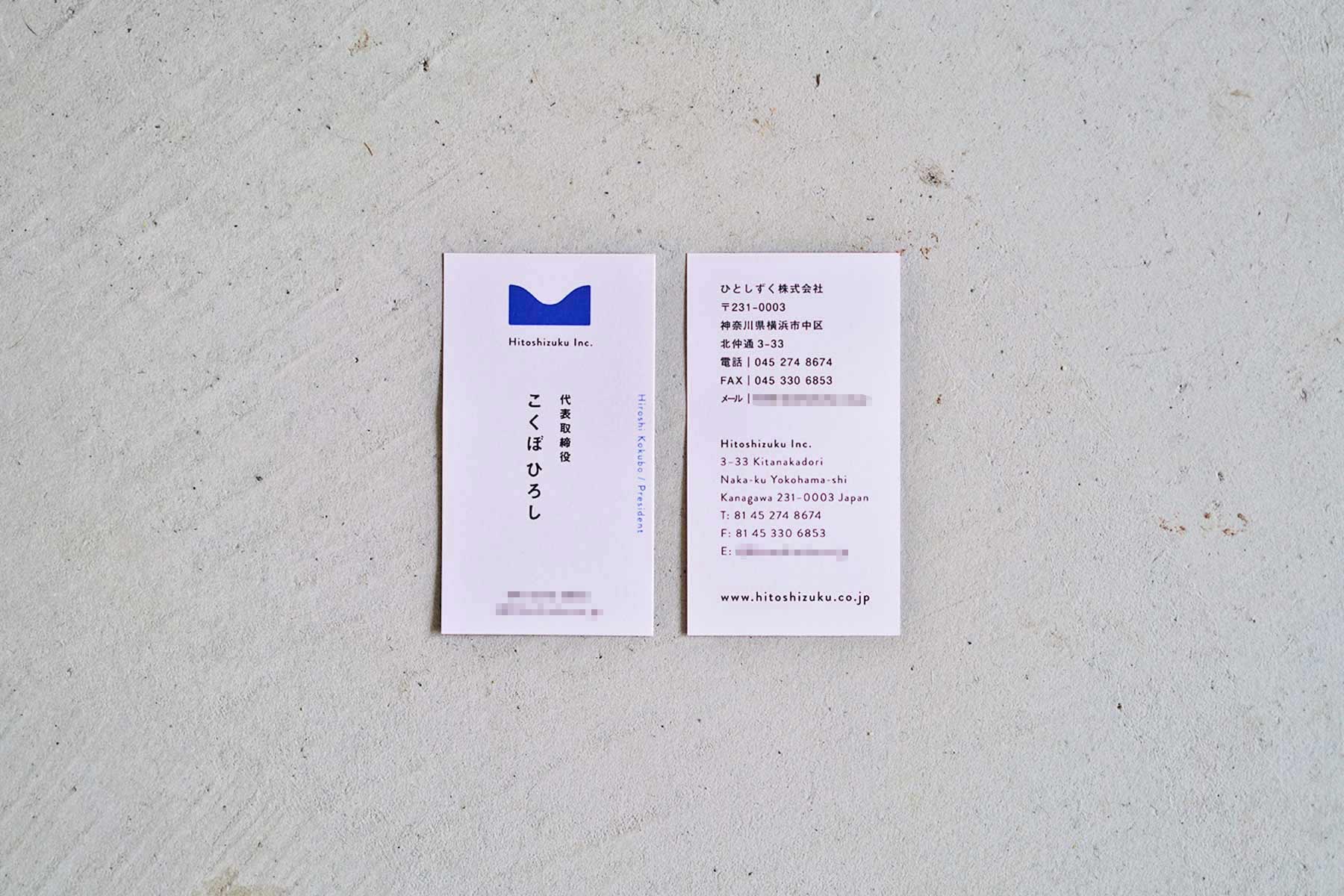
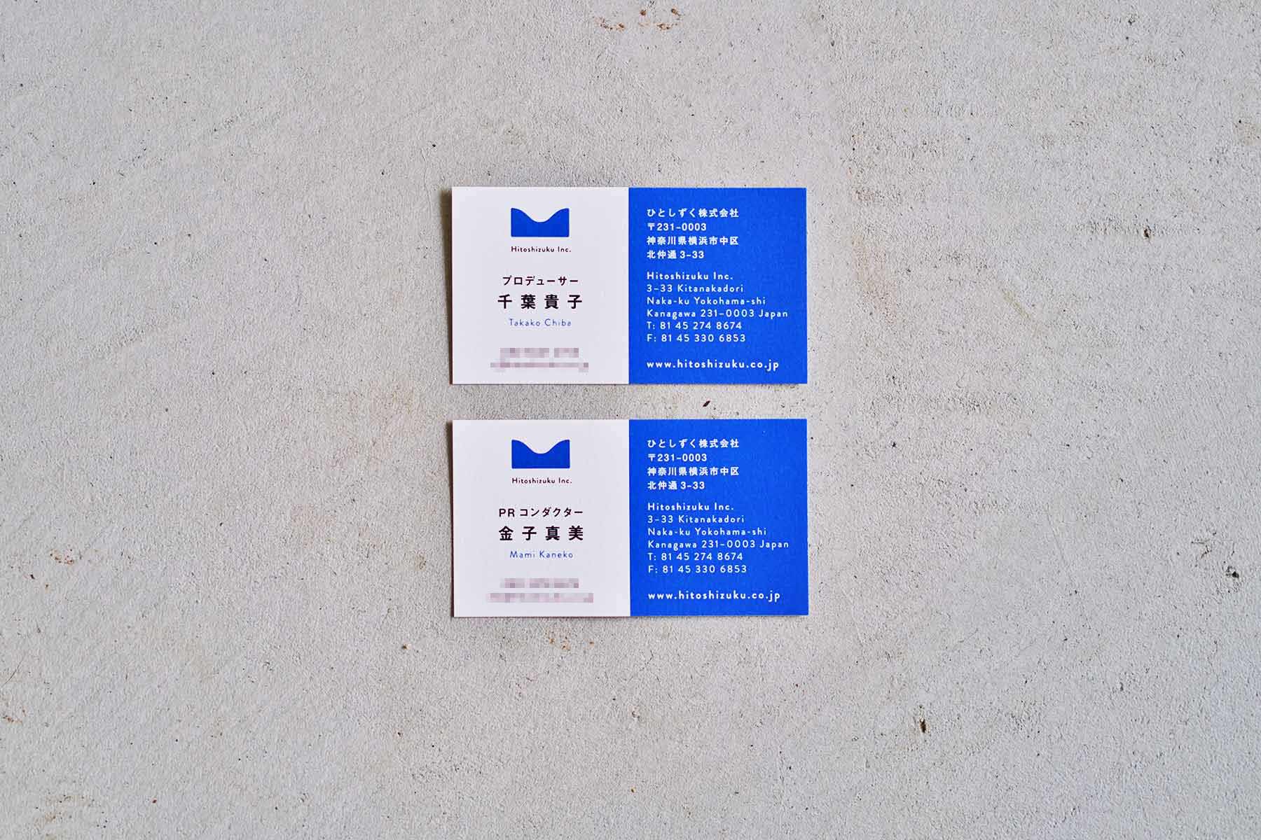
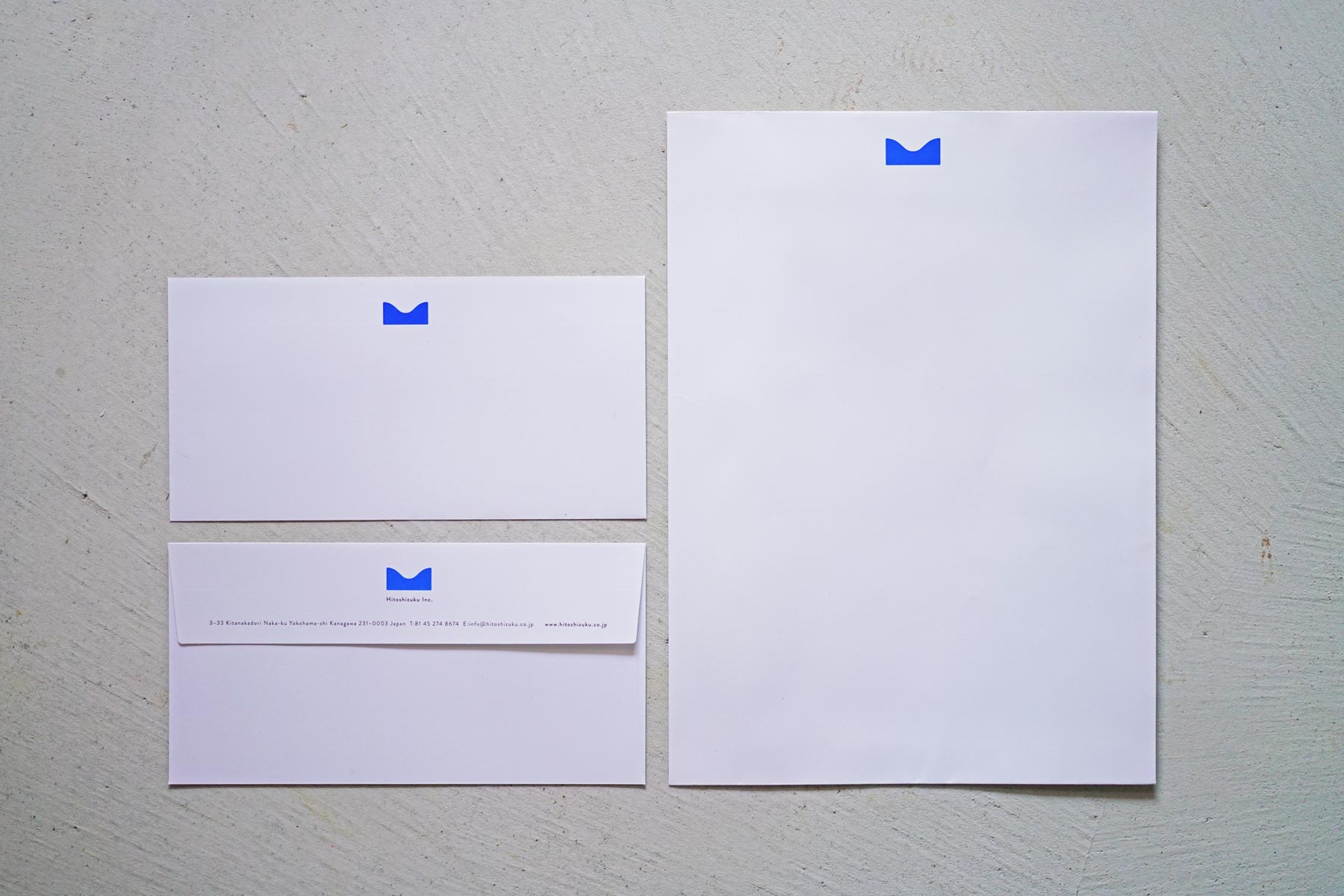
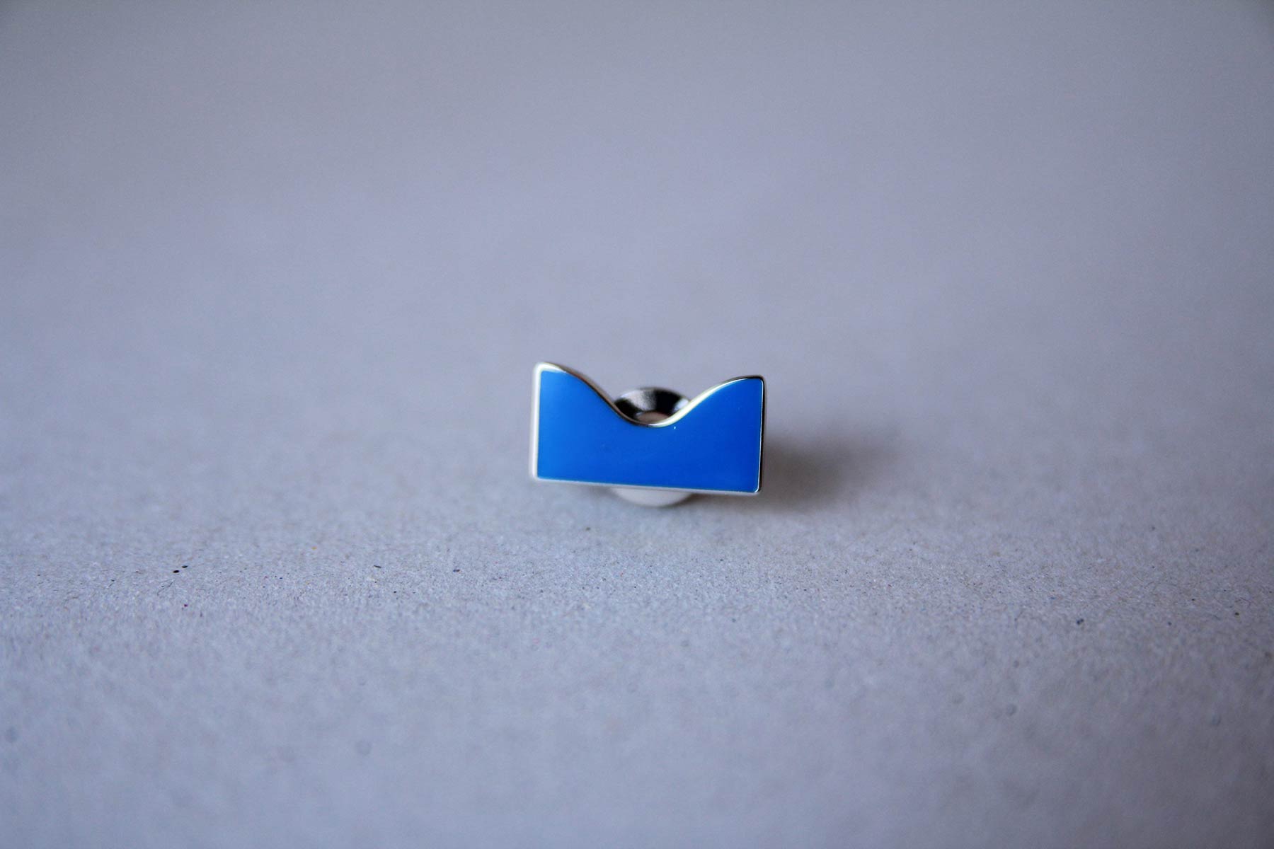
ひとしずく株式会社のロゴ・各種ビジネスツール
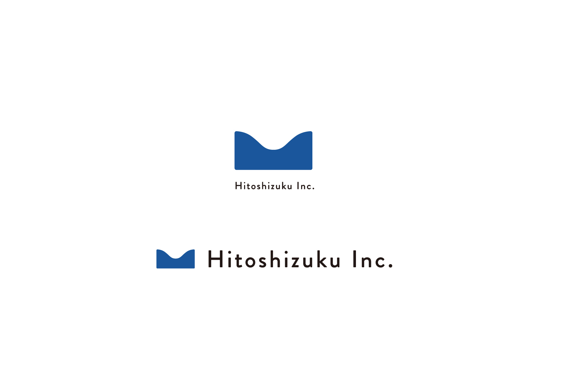
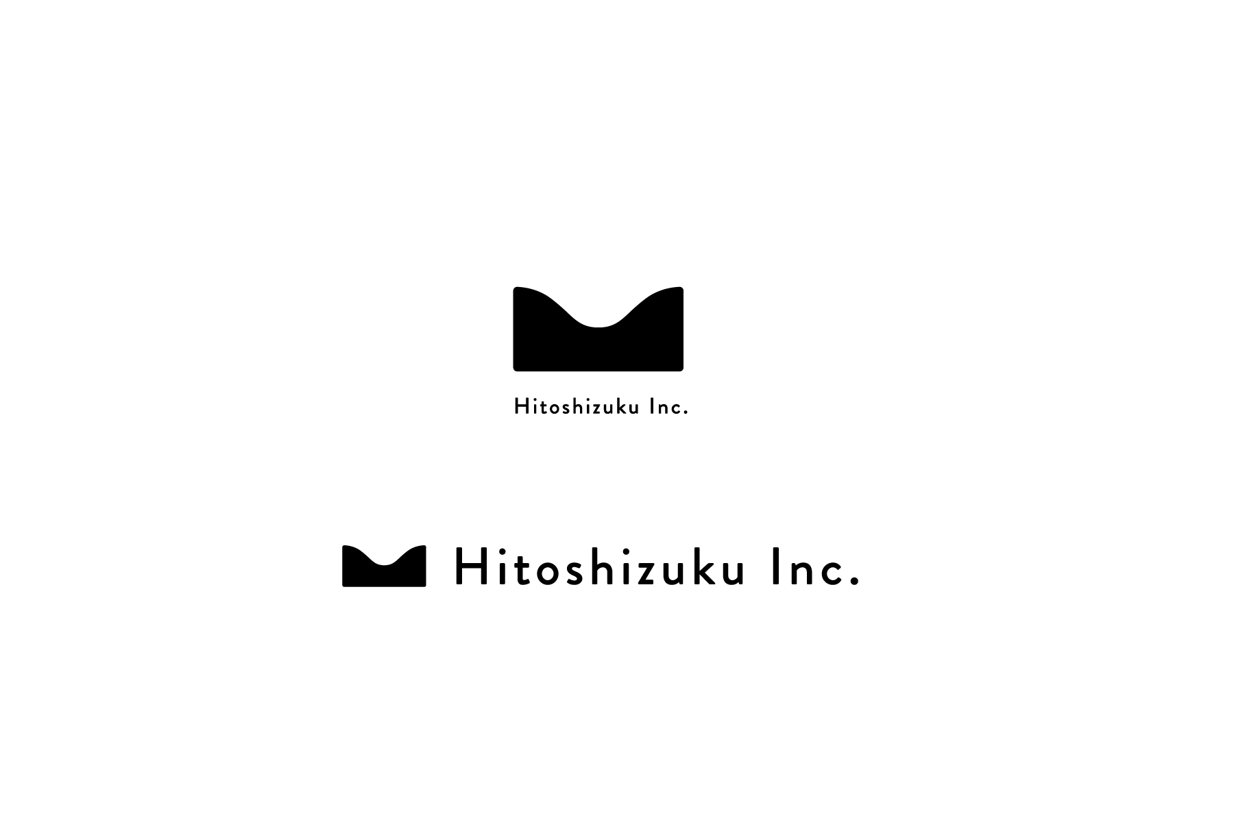
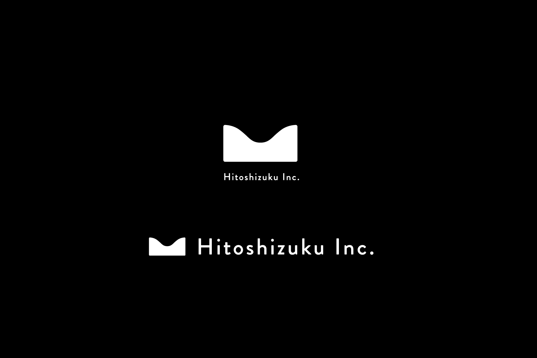
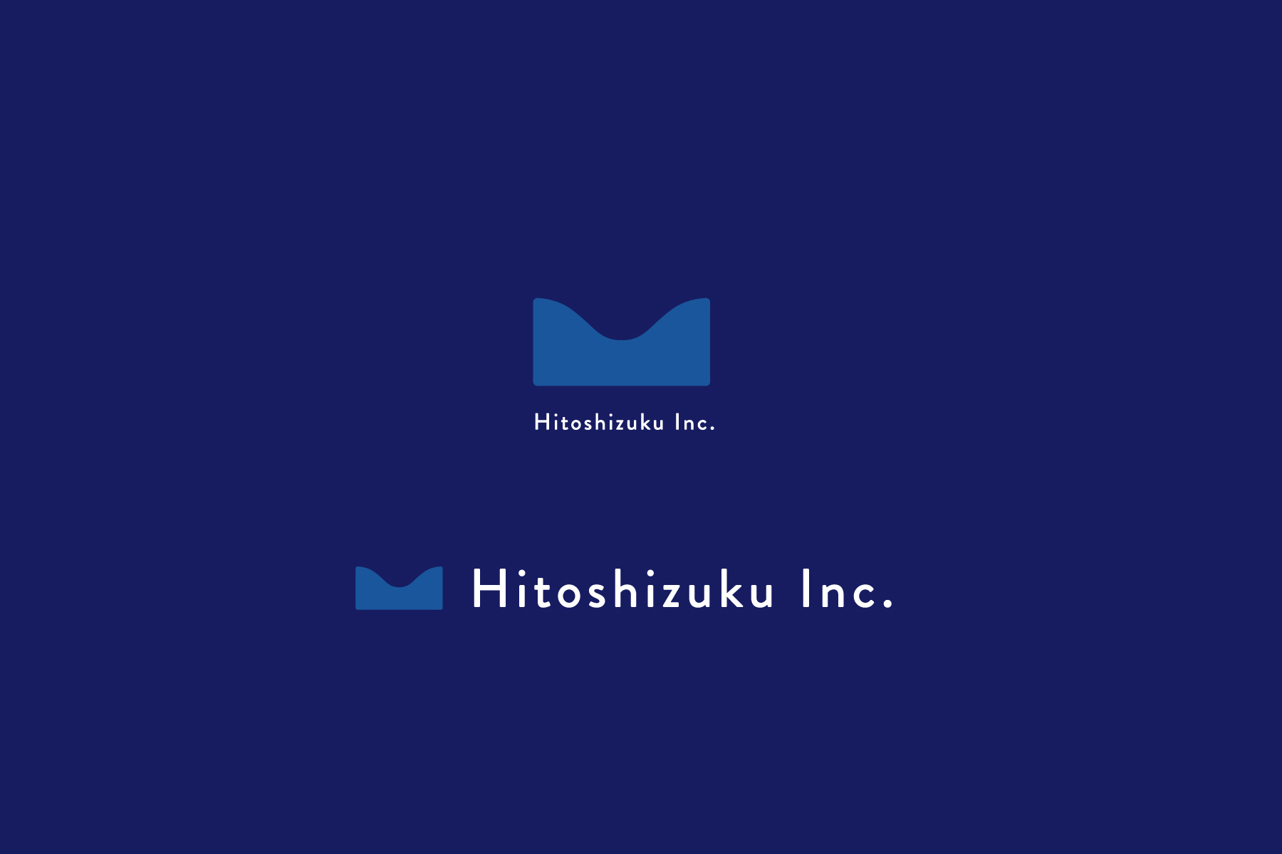
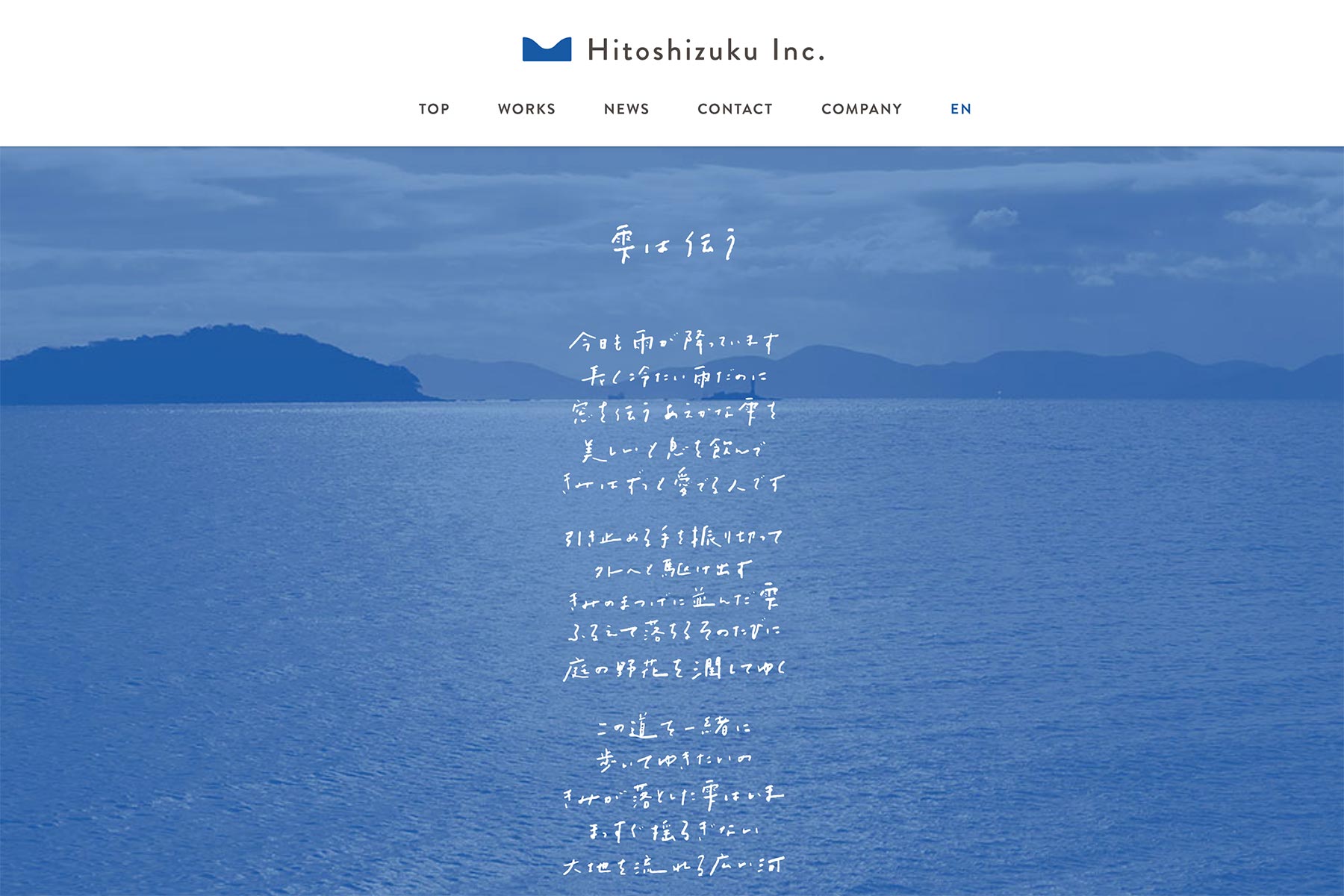
ひとしずく株式会社は、社会課題に本気で取り組んでいるプロフェッショナルな“人”や“法人”を後方支援する、日本初のソーシャルグッド専門のPRエージェンシー。エクアドルの民話「ハチドリのひとしずく」に基づき、“世界を良い方向に変えたい”という想いを「ひとしずく」に例え、社名が生まれた。ロゴマークは、今まさに若葉から滴ろうとする「雫」の意匠。「小さなひとしずくが、やがて大河の一滴になる」という企業理念のように、ロゴマークを横に連ねると、大河・海原の大きな「波」になる。社名・平仮名「ひ」の字形や、クライアントの仕事を尊重し誠実に対応する社風を表す「蝶ネクタイ」のシルエットも、ロゴデザインに隠されている。ウェブサイトに掲載されている詩は、ひとしずく株式会社の理念を表したもの。
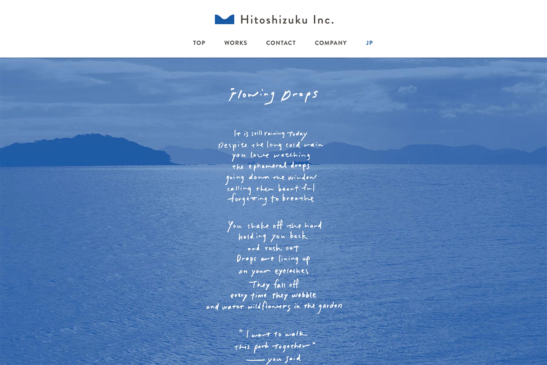
Hitoshizuku Inc. is the first PR agency in Japan specializing in social good & NPO’s, that supports people and companies working to solve social problems. The company name ‘Hitoshizuku’ means a single drop as the symbol of the thought that we want to change the world for good, on the basis of Ecuadorian folklore “Kurikindi, a Golden Bird”. The logo is a shale of a single drop being about to drip from a young leaf. And you can make a shape of the waves of great river or ocean when you line up the logo in a row. Also you may notice that the logo is modeled the Japanese cursive syllabary ‘Hi’ and the silhouette of a bow tie. A poem “Flowing Drops” on the official web site expresses the company’s policy.
Direction, Design: Go Uchida
Writing Policy Poem: Go Uchida
Web Coding: Yamabatosha
Translation: PINE TREE TRANSLATION